
In this blog post, we’ll be exploring what it takes to design a website that offers a great user experience on multiple devices. As you may know, responsive web design is no longer an option – it’s essential for delivering impactful results in today’s digital landscape and it’s expected by your customers. Some of the benefits of a responsive website include:
- Better user experience – consistent design across device types
- Improved SEO – responsive design is preferred by search engines
- More cost-effective and easier to maintain – saves time and money compared to creating separate desktop and mobile sites
- Higher conversion rates – users can easily navigate and interact with the website on any device
Let’s dive into some best practices when considering how to create an effective responsive design strategy.
Understand your target audience and their devices – What sizes and types of screens do they use to access your website or application
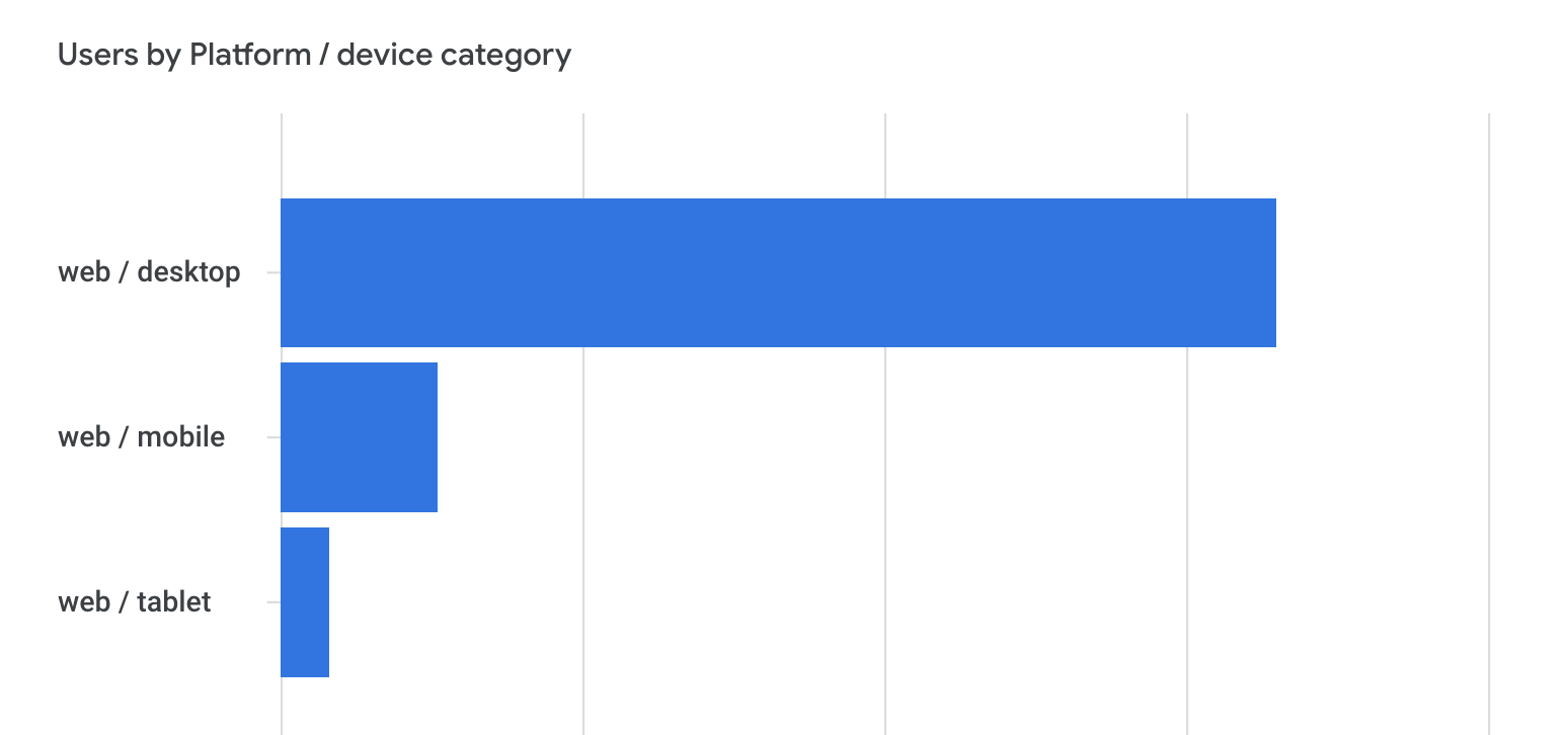
Understanding your target audience and the types of devices they use to access your website is the first thing to figure out. For example, are you a B2B company? If so, it’s likely that the majority of your visitors are visiting your website during the day on a desktop device. Understanding user behavior will help you know which device types to prioritize when developing new features. The best way to understand this is to check the device data in your analytics tool.
Here is an example from GA4 of the device usage for visitors accessing my website:
Understand the differences between desktop and mobile devices, including screen size and capabilities
Not only do desktop and mobile devices have different screen sizes and capabilities, but they also have unique user experiences. Desktops offer more processing power and a larger screen size, allowing for more complex tasks to be completed easily. Meanwhile, mobile devices offer portability and accessibility on the go, making it easier for people to stay connected no matter where they are. As technology continues to evolve, it’s likely that these differences will only become more pronounced, making it crucial for businesses to consider both desktop and mobile when developing their online presence.
Consider usability and user experience when designing for multiple devices
Ensuring that your website can be seamlessly accessed across a range of devices is essential for any organization. But beyond optimizing for functionality, you must also prioritize usability and user experience. This means creating intuitive interfaces that take into account user behavior on each device and tailoring interactions to match those expectations. By doing so, you can elevate your website’s experience beyond a mere checklist of features and into cohesive, engaging journeys that leave a lasting impression on users.
Prioritize design elements based on device type and context
Designing for different device types and contexts requires prioritizing certain design elements over others. Each device type, whether it’s a desktop, mobile phone, or tablet, has its own unique screen size and layout that influences how users engage with and process information. Additionally, different contexts, such as the user’s location or the traffic acquisition channel can also impact how they interact with a website and the type of content the user is seeking. As a result, it’s important to carefully consider fonts, colors, navigation, and usability when designing for specific devices and contexts.
Design for all device types and test your website on as many platforms as possible
When creating new website designs, make sure you’re starting with the device that the majority of your users are using. Most start with desktop designs and mobile is often a secondary thought. But if the majority of your website visitors are accessing your website from a mobile device, you should be starting with mobile designs and then taking desktop into account.
Testing your design on as many devices and browsers as possible will help you identify any potential issues and make the necessary adjustments for a seamless user experience. If you don’t have access to multiple device types, you can use Developer Tools in Chrome to preview how the page will appear on different devices.
Utilize media queries or page builders to adjust styling for different device sizes and orientations
Media queries allow developers to write specific code that will detect the device type and apply the appropriate styles accordingly. If you’re using a WordPress page builder (e.g. Elementor, Divi) on your website, they often provide a method for customizing designs for different device types without the need for adding custom CSS. If you’re on Wix or Squarespace, make sure you check the mobile version of your website in the editor to ensure everything is sized and aligned correctly.
Conclusion: Having a responsive website is essential for any business looking to stay competitive
Creating a responsive website requires careful consideration of both design elements and the user experience in order to ensure users have the best experience regardless of their device type. Understanding the differences between devices – including screen size and capabilities – as well as understanding your target audience’s device types is essential to success.
If you find yourself struggling with optimizing your website or application for multiple device types, consider reaching out for help from a professional who can provide guidance and support. Do you need help optimizing your website for all device types? We’re here to help – contact us today to get started!